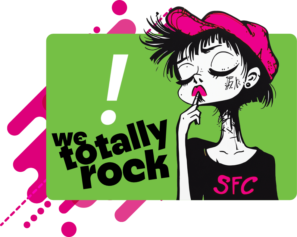
Another agency hyping itself?
It only matters because it’s ours. Seriously.
For seven years, SFC Group has grown the same way we work: fast, focused, and always a little louder than expected. Our model hasn’t changed — and it hasn’t needed to. Smart strategy, sharp creative, and a team that actually shows up for clients will never go out of style.
But how we talk about ourselves?

But how we talk about ourselves?
That was ready for an upgrade.
Not a rebrand.
Not a makeover.
Not a reset of who we are.
Just a campaign that finally matches the energy we’ve had all along.
Because we’re not the quiet type — never have been.
Healthcare marketing is crowded. Every agency says the same things, shows the same things, and promises the same things.
And then there’s us.
We’ve spent seven years proving that great work doesn’t need a bloated team, a 12-step process, or a timesheet with “mystery hours” on it. We’ve proved that clever and strategic can coexist. We’ve built category-defying campaigns and helped clients break through noise that should have drowned them out.

We didn’t need a new story.
We just needed to tell ours the way we tell everything else — directly, creatively, and impossible to ignore.
introducing
seriously

A campaign as creative, as sharp, and as delightfully unfiltered as the team behind it.
This campaign amplifies what we’ve always done best:

Turn strategy into something you can feel

Turn creative into something you remember

Turn healthcare marketing into something that actually works
Clever, not cutesy. Fun, not frivolous. Confident, not overbearing. SFC, but louder.

Why it matters for our clients
This isn’t about changing who we are — it’s about expressing who we’ve always been.
A stronger voice does real work:
- It cuts through sameness in healthcare marketing.
- It signals the momentum we’ve earned.
- It reinforces why clients trust us.
- It sets the bar for the kind of creative we expect from ourselves.

It’s not a shift in direction.
It’s a spotlight on what’s always powered us:
serious work delivered with serious personality.
Where we’re headed
More head-turning strategy.
More creative that doesn’t look like anything else in the category.
More work that proves healthcare marketing doesn’t have to be safe, beige, or boring.
More client forecasts blown past — again.
We’ve always been SFC.
Now we’re just saying it louder.
seriously